QT-PyQt-PySide-Custom-Widgets - Analog Gauge
Install the custom widgets
pip install QT-PyQt-PySide-Custom-Widgets
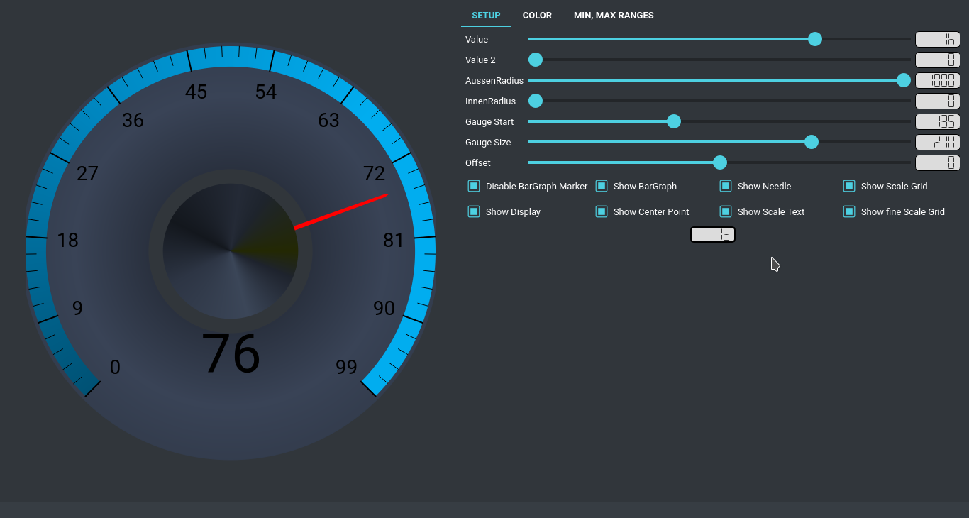
PyQt/PySide Analog Gauge Meter
Video Tutorial
Download
Download an example.
Creating Widget
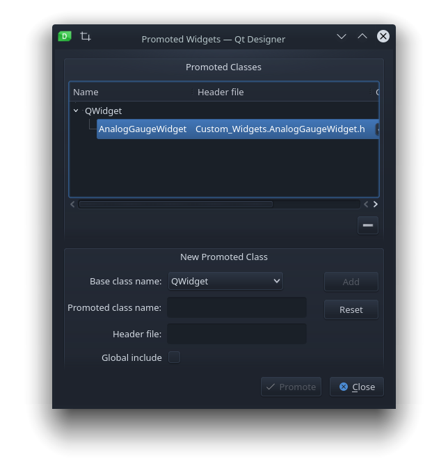
Create a widget with a custom promote class inside QT Designer as shown below:
- Add
Qidgetto the UI
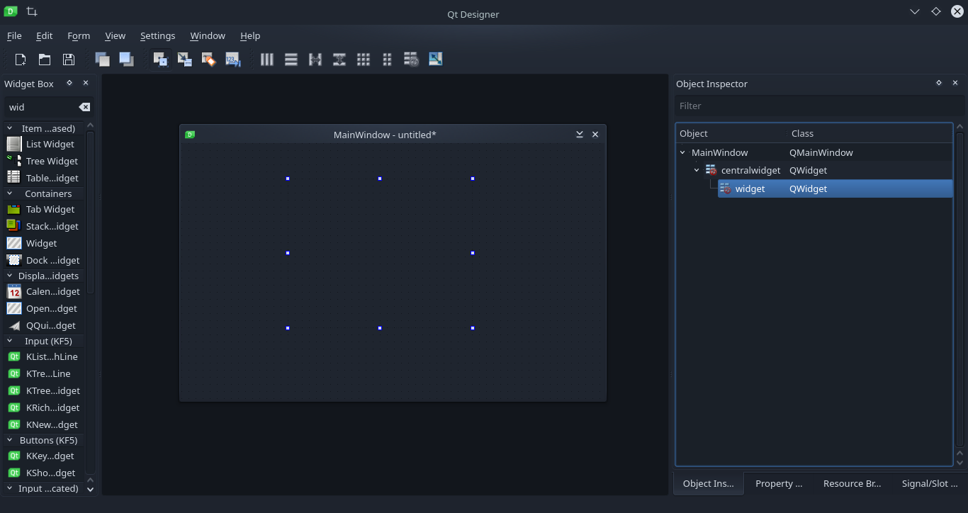
- Right click on the widget, select promote.
- Inside the Promoted Widgets container, enter “AnalogGaugeWidget” as the class name and “Custom_Widgets.AnalogGaugeWidget.h” as the header file name the click on “add”.
After designing your user interface file (UI), convert it to a python code.
Customizing Widget
Note: in these example “self.ui.widget” is the widget name from the User Interface file.
Set gauge units
################################################################################################
# Set gauge units
################################################################################################
self.ui.widget.units = "Km/h"
Set minimum and maximum gauge value
################################################################################################
# Set minimum gauge value
################################################################################################
self.ui.widget.minValue = 0
# OR
self.ui.widget.setMinValue(self.ui.MaxValueSlider.value())
################################################################################################
# Set maximum gauge value
################################################################################################
self.ui.widget.maxValue = 100
# OR
self.ui.widget.setMaxValue(100)
Set gauge scale divisions
################################################################################################
# Set scale divisions
################################################################################################
self.ui.widget.scalaCount = 10

# OR

self.ui.widget.setScalaCount(10)
Set scale start position
# Start from the minimum value
# self.ui.widget.updateValue(self.ui.widget.minValue)
# OR
# Start from half/middle value
self.ui.widget.updateValue(int(self.ui.widget.maxValue - self.ui.widget.minValue)/2)
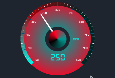
Select preset widget theme
################################################################################################
# Select gauge theme
################################################################################################
self.ui.widget.setGaugeTheme(8) #theme number range from 0 to 10
Create your own custom gauge theme
Use the code examples below to customize your gauge theme:
self.ui.widget.setCustomGaugeTheme(
    color1 = "#FF2B00",
    color2= "#821600",
    color3 = "#260600"
)

self.ui.widget.setCustomGaugeTheme(
	color1 = "#002523",
	color2= "#990008",
	color3 = "#00F6E9"
)

self.ui.widget.setCustomGaugeTheme(
    color1 = "#fff",
    color2= "#555",
    color3 = "#000"
)

self.ui.widget.setScalePolygonColor(
    color1 = "red"
)

self.ui.widget.setNeedleCenterColor(
    color1 = "red"
)

self.ui.widget.setOuterCircleColor(
    color1 = "red"
)

self.ui.widget.setBigScaleColor("#005275")
self.ui.widget.setFineScaleColor("#005275")
Set offset angle
self.ui.widget.updateAngleOffset(0)
Set scale start angle
self.ui.widget.setScaleStartAngle(135)
Set scale total angle
self.ui.widget.setTotalScaleAngleSize(270)
Enable/Disable bar graph
# True or False
self.ui.widget.setEnableBarGraph(True)
Enable/Disable value text
# True or False
self.ui.widget.setEnableValueText(True)
Enable/Disable center point
# True or False
self.ui.widget.setEnableCenterPoint(True)
Enable/Disable needle pointer
# True or False
self.ui.widget.setEnableNeedlePolygon(True)
Enable/Disable scale text
# True or False
self.ui.widget.setEnableScaleText(True)
Enable/Disable scale polygon
# True or False
self.ui.widget.setEnableScalePolygon(True)
Enable/Disable big scale
# True or False
self.ui.widget.setEnableBigScaleGrid(True)
Enable/Disable fine scale
# True or False
self.ui.widget.setEnableFineScaleGrid(True)
Set gauge color outer radius factor
# 0 - 1000
self.ui.widget.setGaugeColorOuterRadiusFactor(1000)
Set gauge color inner radius factor
# 0 - 1000
self.ui.widget.setGaugeColorInnerRadiusFactor(0)
Set needle color
# RGBA int values range from 0- 255
self.ui.widget.setNeedleColor(R=R, G=G, B=B, Transparency=Transparency)
Set needle color on drag
# RGBA int values range from 0- 255
self.ui.widget.setNeedleColorOnDrag(R=R, G=G, B=B, Transparency=Transparency)
Set scale value color
# RGBA int values range from 0- 255
self.ui.widget.setScaleValueColor(R=R, G=G, B=B, Transparency=Transparency)
Set display value/units color
# RGBA int values range from 0- 255
self.ui.widget.setDisplayValueColor(R=R, G=G, B=B, Transparency=Transparency)
Customizing the Widget from a JSON file
You can also use a Json stylesheet to customize the gauge.
Below is the full JSon sample stylesheet. Also watch the video tutorial for the full guide. Watch the tutorial videos here
Full JSON stylesheet sample
{
	"AnalogGaugeWidget": [{
		"name": "widget",
		"units": "Mph",
		"minValue": "100",
		"maxValue": "500",
		"scalaCount": "5",
		"startValue": "250",
		"gaugeTheme": "0",
		"offsetAngle": "0",
		"outerRadius": "1000",
		"innerRadius": "900",
		"scaleStartAngle": "135",
		"totalScaleAngle": "270",
		"enableBarGraph": true,
		"enableValueText": true,
		"enableCenterPoint": true,
		"enableNeedlePolygon": true,
		"enableScaleText": true,
		"enableScaleBigGrid": true,
		"enableScaleFineGrid": true,
		"needleColor": "#002523",
		"needleColorOnDrag": "red",
		"scaleValueColor": "#fff",
		"displayValueColor": "#00F6E9",
		"bigScaleColor" : "#005275",
		"fineScaleColor" : "#005275",
		"customGaugeTheme": [{
			"color1": "#002523",
			"color2": "#990008",
			"color3": "#00F6E9"
		}],
		"scalePolygonColor": [{
			"color1": "#002523",
			"color2": "#990008",
			"color3": "#00F6E9"
		}],
		"needleCenterColor": [{
			"color1": "#002523",
			"color2": "#990008",
			"color3": "#00F6E9"
		}],
		"outerCircleColor": [{
			"color1": "#002523",
			"color2": "#0000",
			"color3": "#00F6E9"
		}],
		"valueFontFamily": [{
			"path": "fonts/ds_digital/DS-DIGIB.TTF",
			"name": "DS-Digital"
		}],
		"scaleFontFamily": [{
			"path": "fonts/ds_digital/DS-DIGIB.TTF",
			"name": "DS-Digital"
		}]
	}]
}