QT-PyQt-PySide-Custom-Widgets - Custom Progress Bar / Form Progress Indicator
Install the custom widgets
pip install QT-PyQt-PySide-Custom-Widgets
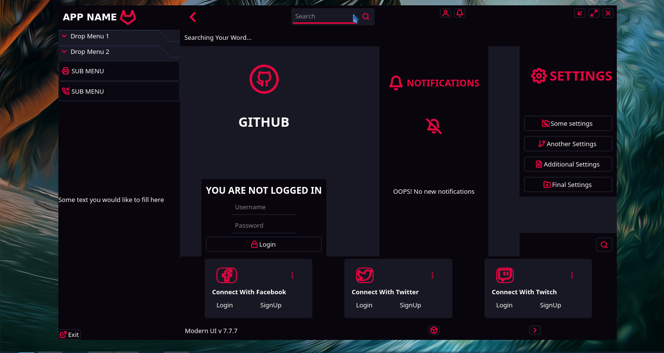
Custom Responsive PyQt/PySide Interface With Animated Transition
GUI Design In QT Designer.
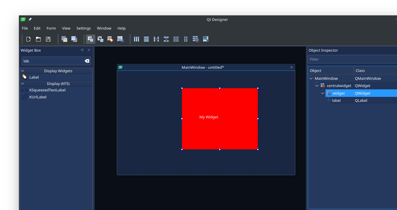
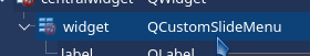
- Add the
QWidgetto your UI
- Promote the widget class -Right-click on your widget, then click on “promote to”.
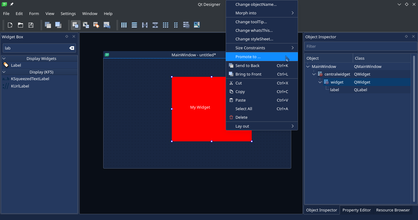
-
Enter the promote class and header file
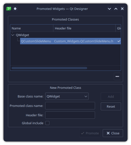
-
Inside the promote classes widget,
- under base class name select “QWidget”
- under promote class name enter “QCustomSlideMenu”
- under header file name enter “Custom_Widgets.QCustomSlideMenu.h”
- check the “Global Include” check box
- click on “add”
- now click on “Promote”
- Under object inspector your widget should look like this:
- Now save the UI(User interface) and generate the UI python code
Now you can be able to customize and animate this widget transition directly from your python file or using a JSon file.
Customizing The Responsive Widget Using the JSon File
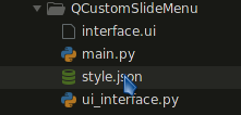
Inside the root of your project folder, create the “style.json” file which will contain all the values that will animate and customize this widget.
This is how my project folder looks like:
Inside the “style.json” file create “QCustomSlideMenu” main object:
{
	"QCustomSlideMenu": [{
	}]
}
Pass the name of your widget:
{
	"QCustomSlideMenu": [{
		"name": "my_widget_name"
	}]
}
Please NOTE that all other JSon values are OPTIONAL, the only value that you must pass for your widget to be customizedis the widget name. If you dont pass any JSon style, the default style will be applied to these widgets.
Enter widget size:
Enter integer value or “auto”, in “auto” size the widget will expand or contract depending on the available window size
{
	"QCustomSlideMenu": [{
		"name": "my_widget_name",
		"defaultSize": [{
			"width": 250,
			"height": "auto"
		}]
	}]
}
Enter widget size when minimized/collapsed:
This is the minimum size that will be applied to the the widget when it is fully minimized. The “auto” value applies “0” width or height to the widget
{
	"QCustomSlideMenu": [{
		"name": "my_widget_name",
		"collapsedSize": [{
			"width": 250,
			"height": "auto"
		}]
	}]
}
Enter widget size when maximized/expanded:
This is the maximum size that will be applied to the the widget when it is fully maximized. The “auto” value applies the full available width or height to the widget
{
	"QCustomSlideMenu": [{
		"name": "my_widget_name",
		"expandedSize": [{
			"width": 250,
			"height": "auto"
		}]
	}]
}
Match widget size with parent:
You can also use “parent” instead of auto to give your widget a fixed size that matches the parent size.
{
	"QCustomSlideMenu": [{
		"name": "my_widget_name",
		"defaultSize": [{
			"width": "parent",
			"height": "auto"
		}],
		"collapsedSize": [{
			"width": "parent",
			"height": "auto"
		}],
		"expandedSize": [{
			"width": "parent",
			"height": "auto"
		}]
	}]
}
The above widget will have a fixed width that matches the parent witdth even when minimized or maximized.
Enter widget style when maximized/expanded or minimized/collapsed:
You can pass the style that will be applied to the widget when it is collapsed or expanded
{
	"QCustomSlideMenu": [{
		"name": "my_widget_name",
		"menuContainerStyle": [{
			"whenMenuIsCollapsed": [
				"border: 2px solid transparent"
			],
			"whenMenuIsExpanded": [
				"border: 2px solid rgb(9, 5, 13); background-color: rgb(9, 5, 13;"
			]
		}]
	}]
}
Customizing the widget transition animation:
Change the animation duration and the animation easing curve
{
	"QCustomSlideMenu": [{
		"name": "my_widget_name",
		"menuTransitionAnimation": [{
			"animationDuration": 2000,
			"animationEasingCurve": "Linear"
		}]
	}]
}
This will be applied to both expanding and minimizing transitions
If you want each transition to have different animation properties, then do the following:
{
	"QCustomSlideMenu": [{
		"name": "my_widget_name",
		"menuTransitionAnimation": [{
			"whenCollapsing": [{
				"animationDuration": 500,
				"animationEasingCurve": "Linear"
			}],
			"whenExpanding": [{
				"animationDuration": 500,
				"animationEasingCurve": "OutInBack"
			}]
		}]
	}]
}
Adding the “toggle” button
Assuming that you want your widget to be expanded or minimized, then you can add a “QPushButton” which when clicked will minimize or expand your widget.
Adding the button name:
{
	"QCustomSlideMenu": [{
		"name": "my_widget_name",
		"toggleButton": [{
			"buttonName": "my_toggle_button"
		}]
	}]
}
Adding button icons:
You can also add button icons which will be used to indicate if the associated widget is minimized or expanded
{
	"QCustomSlideMenu": [{
		"name": "my_widget_name",
		"toggleButton": [{
			"buttonName": "my_toggle_button",
			"icons": [{
				"whenMenuIsCollapsed": ":/icons/icons/align-left.svg",
				"whenMenuIsExpanded": ":/icons/icons/chevron-left.svg"
			}]
		}]
	}]
}
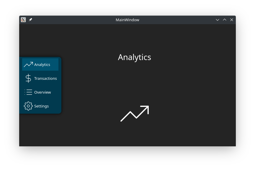
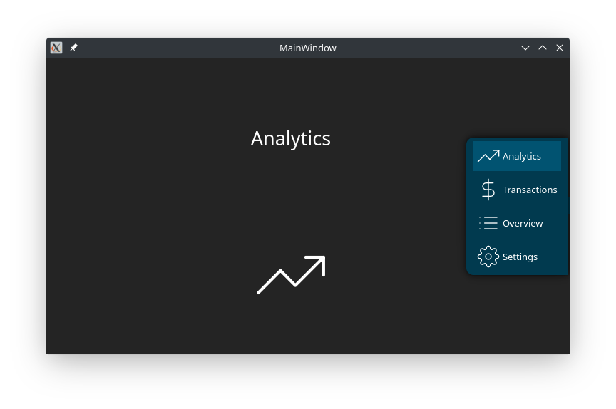
Floating “menu”/absolute positioned widget:
The new update will now let you decide if you want your widget to float(be positioned on top of other widgets). One thing you should keep in mind is that, in order for the widget to have an absolute position, the widget has to be removed from the parent layout. So when ddesigning you UI, its advised that you dont place your floating widget directly inside the “main central widget”. Use “floatPosition” to float your widget:
{
	"QCustomSlideMenu": [{
		"name": "my_widget_name",
		"floatPosition": [
			{

			}
		]
	}]
}
Select the relative position to place the widget, use a differnt widget which does not directly house your floating widget, I recommend that you use the “central widget”:
{
	"QCustomSlideMenu": [{
		"name": "my_widget_name",
		"floatPosition": [
			{
				"relativeTo": "centralwidget"
			}
		]
	}]
}
Select the widget floating position(relative to the new parent-“relativeTo”: “centralwidget”). Available options:
- top-right
- top-left
- top-center
- bottom-left
- bottom-right
- bottom-center
- center-center
- center-left
- center-right
{
	"QCustomSlideMenu": [{
		"name": "my_widget_name",
		"floatPosition": [
			{
				"relativeTo": "centralwidget",
				"position": "center-right"
			}
		]
	}]
}
You can also apply a shadow to your floating widget:
{
	"QCustomSlideMenu": [{
		"name": "my_widget_name",
		"floatPosition": [
			{
				"relativeTo": "centralwidget",
				"position": "center-right",
				"shadow":[
					{
						"color": "#000",
						"blurRadius": 20,
						"xOffset": 0,
						"yOffset": 0
					}
				]
			}
		]
	}]
}
Adding button styles:
If you want to apply defferent styles to your button when the widget is minimized or maximized then you can use the “style” object as shown:
{
	"QCustomSlideMenu": [{
		"name": "my_widget_name",
		"toggleButton": [{
			"buttonName": "my_toggle_button",
			"style": [{
				"whenMenuIsCollapsed": [
					"border: 2px solid transparent"
				],
				"whenMenuIsExpanded": [
					"border: 2px solid rgb(9, 5, 13)"
				]
			}]
		}]
	}]
}
Apply the JSon stylesheet:
To apply the JSon stylesheet just call the following function from your “main” python file:
########################################################################
# APPLY JSON STYLESHEET
########################################################################
# self = QMainWindow class
# self.ui = Ui_MainWindow / user interface class
loadJsonStyle(self, self.ui)
########################################################################
An Example of the full JSon Style object:
{
	"QCustomSlideMenu": [{
		"name": "menu_widget",
		"defaultSize": [{
			"width": 250,
			"height": "auto"
		}],
		"collapsedSize": [{
			"width": 0,
			"height": 0
		}],
		"expandedSize": [{
			"width": 200,
			"height": "auto"
		}],
		"toggleButton": [{
			"buttonName": "open_close_side_bar_btn",
			"icons": [{
				"whenMenuIsCollapsed": ":/icons/icons/align-left.svg",
				"whenMenuIsExpanded": ":/icons/icons/chevron-left.svg"
			}],
			"style": [{
				"whenMenuIsCollapsed": [
					"border: 2px solid transparent"
				],
				"whenMenuIsExpanded": [
					"border: 2px solid rgb(9, 5, 13)"
				]
			}]
		}],
		"menuTransitionAnimation": [{
			"animationDuration": 2000,
			"animationEasingCurve": "Linear",
			"whenCollapsing": [{
				"animationDuration": 500,
				"animationEasingCurve": "Linear"
			}],
			"whenExpanding": [{
				"animationDuration": 500,
				"animationEasingCurve": "OutInBack"
			}]
		}],
		"menuContainerStyle": [{
			"whenMenuIsCollapsed": [
				"border: 2px solid transparent"
			],
			"whenMenuIsExpanded": [
				"border: 2px solid rgb(9, 5, 13); background-color: rgb(9, 5, 13)"
			]
		}],
		"floatPosition": [
			{
				"relativeTo": "centralwidget",
				"position": "center-right",
				"shadow":[
					{
						"color": "#000",
						"blurRadius": 20,
						"xOffset": 0,
						"yOffset": 0
					}
				]
			}
		]
	}]
}
Customizing The Responsive Widget From Your Python File:
Customize the container:
Change multiple values…
########################################################################
# CUSTOMIZE YOUR "MENU" / CONTAINER WIDGET
########################################################################
my_widget.customizeQCustomSlideMenu(
    ########################################################################
    # THESE VALUES ARE OPTIONAL
    # ONLY PASS THE VALUES YOU WANT TO CHANGE
    ########################################################################
    # CHANGE THE DEFAULT WIDGET SIZE ON APP STARTUP
    defaultWidth = 500,
    defaultHeight = 500,
    # CHANGE THE WIDGET SIZE WHEN CALLAPSED/MINIMIZED
    collapsedWidth = 0,
    collapsedHeight = 0,
    # CHANGE THE WIDGET SIZE WHEN EXPANDED/MAXIMIZED
    expandedWidth = 500,
    expandedHeight = 500,
    # CHANGE THE DEFAULT ANIMATION DURATION AND EASING CURVE
    # BY DEFAULT IT WILL BE APPLIED THE WIDGET IS EXPANDED OR COLLAPSED
    animationDuration = 500,
    animationEasingCurve = QtCore.QEasingCurve.Linear,
    # CHANGE ANIMATION DURATION AND EASING CURVE WHEN THE WIDGET IS COLLAPSING
    collapsingAnimationDuration = 500,
    collapsingAnimationEasingCurve = QtCore.QEasingCurve.Linear,
    # CHANGE ANIMATION DURATION AND EASING CURVE WHEN THE WIDGET IS EXPANDING
    expandingAnimationDuration = 500,
    expandingAnimationEasingCurve = QtCore.QEasingCurve.Linear,
    # PASS THE STYLESHEET THAT WILL BE APPLIED TO THE WIDGET WHEN EXPANDED OR COLLAPSED
    collapsedStyle = "",
    expandedStyle = "",
    # FLOAT OPTIONS
    floatMenu = True, #bool
    relativeTo = self.ui.centralwidget,
    position = "top-right",
    shadowColor = "#000",
    shadowBlurRadius    = 20,
    shadowXOffset   = 0,
    shadowYOffset   = 0
)
or change single values
########################################################################
# CHANGE SINGLE VALUES OF YOUR "MENU" / CONTAINER WIDGET
########################################################################
# CHANGE THE WIDGET SIZE WHEN CALLAPSED/MINIMIZED
my_widget.collapsedWidth = 0
my_widget.collapsedHeight = 0

# CHANGE THE WIDGET SIZE WHEN EXPANDED/MAXIMIZED
my_widget.expandedWidth = 500
my_widget.expandedHeight = 500

# CHANGE THE DEFAULT ANIMATION DURATION AND EASING CURVE
# BY DEFAULT IT WILL BE APPLIED THE WIDGET IS EXPANDED OR COLLAPSED
my_widget.animationDuration = 500
my_widget.animationEasingCurve = QtCore.QEasingCurve.Linear

# CHANGE ANIMATION DURATION AND EASING CURVE WHEN THE WIDGET IS COLLAPSING
my_widget.collapsingAnimationDuration = 1000
my_widget.collapsingAnimationEasingCurve = QtCore.QEasingCurve.OutBack

# CHANGE ANIMATION DURATION AND EASING CURVE WHEN THE WIDGET IS EXPANDING
my_widget.expandingAnimationDuration = 2000
my_widget.expandingAnimationEasingCurve = QtCore.QEasingCurve.OutQuad

# PASS THE STYLESHEET THAT WILL BE APPLIED TO THE WIDGET WHEN EXPANDED OR COLLAPSED
my_widget.collapsedStyle = ""
my_widget.expandedStyle = ""

#FLOAT THE WIDGET
my_widget.float = True
my_widget.floatPosition = "center-center"
#YOU CAN ALSO APPL THE SHADOW EFFECT TO THE FLOATING WIDGET
# (CREATE SHADOW EFFECT)
my_widget.setGraphicsEffect(SHADOW_EFFECT)
Animate the widget:
You can bind these animation functions to a button event or function call.
########################################################################
# ANIMATE YOUR "MENU" / CONTAINER WIDGET
########################################################################
# TOGGLE WIDGET SIZE
# EXPAND THE WIDGET IF IT IS CURRENTLY COLLAPSED
# OR
# COLLAPSE THE WIDGET IF IT IS CURRENTLY EXPANDED
my_widget.slideMenu()

# COLLAPSE WIDGET SIZE
my_widget.collapseMenu()

# EXPAND WIDGET SIZE
my_widget.expandMenu()
More
Watch video tutorials here
Download the source code here