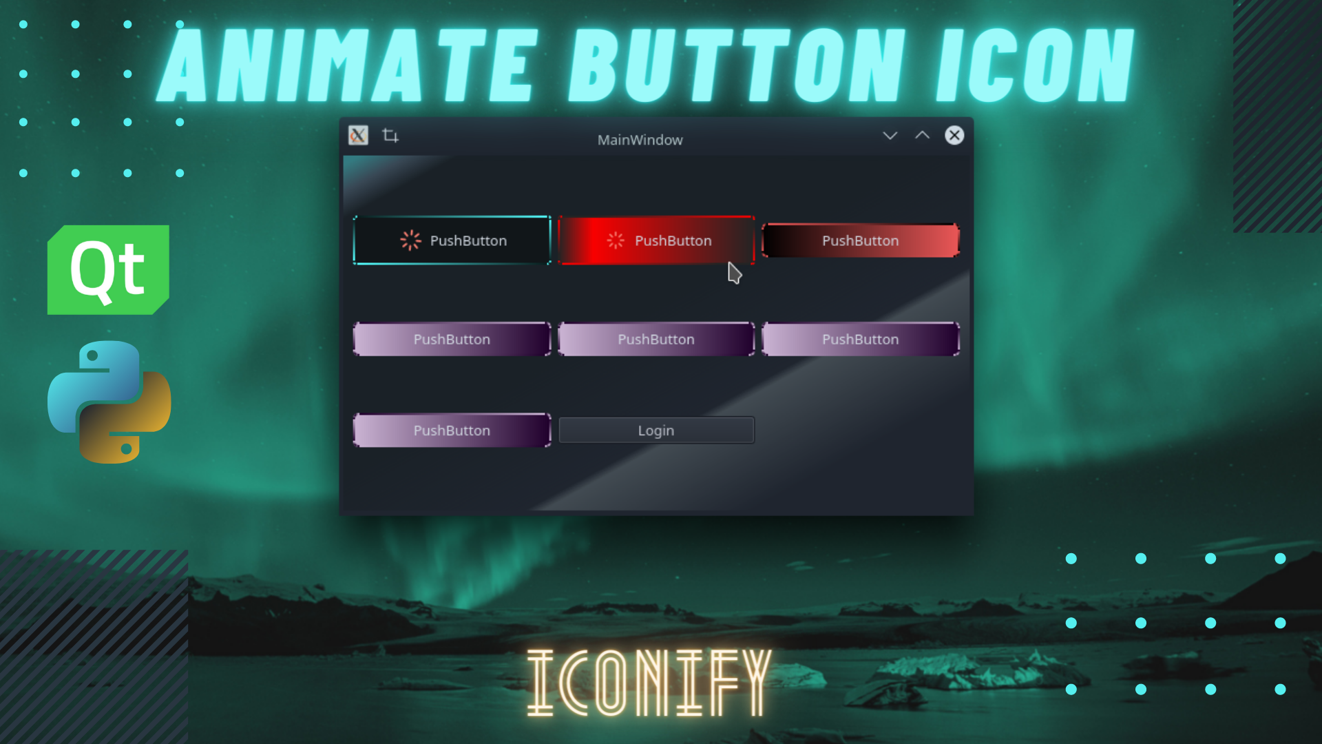
QT-PyQt-PySide-Custom-Widgets - Customizing QPushButtons
Install the custom widgets
pip install QT-PyQt-PySide-Custom-Widgets
Customizing QPushButtons
Download
Download an example.
The following steps will show you how to customize the look and animation of your QPushButtons.
1. Create QPushButton widget.
- Open QT Designer, add
QPushButtonwidget to your interface. - Right-click on the button, select “Promote widgets..” from the menu.
- From the promote widgets form:
- Under “Base class name” select
QPushButton - Under “Promote class name” enter
QCustomQPushButton - Under “Header file” enter
Custom_Widgets.QCustomQPushButton.h
- Under “Base class name” select
- Then click on “promote”.
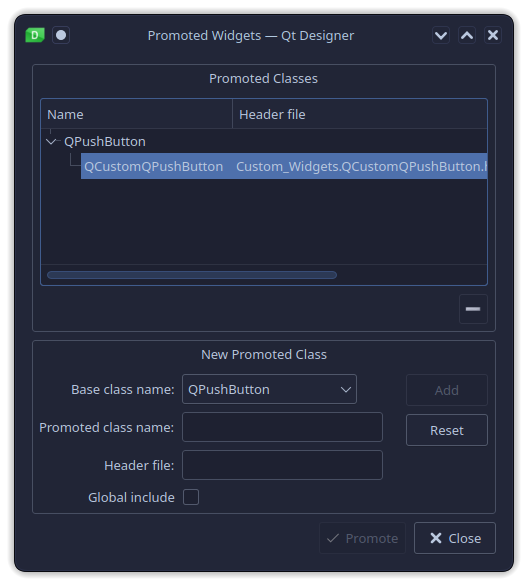
- Generate your UI python code.
2. Styling QPushButton
Using QT-PyQt-PySide-Custom-Widgets, you can style your buttons using a JSon file or directly from your python file.
A. Applying QPushButton Style from a python file
Theme
QT-PyQt-PySide-Custom-Widgets has 13 preset themes that you can apply to your button as shown below:
# Appy pre-set theme to your button
# Theme number can range from 1 to 13
myButton.setObjectTheme(2) #theme number 2
You can also create your own custom button theme by passing the colors of your choice as shown:
# Appy custom theme to your button
# Pass two colors of your choice
myButton.setObjectCustomTheme("#fff", "#000")
Hint: Pass two different colors if you want to apply a background gradient to your button as shown above. Pass two similar colors if you want your button to have a uniform background color as shown below.
# Appy custom theme to your button
# Pass two colors of your choice
# Uniform background color(white)
myButton.setObjectCustomTheme("#fff", "#fff")
Animate QPushButton background and border
After applying your button theme, you can chose to animate the backround color, border or both.
Animation trigger event:
myButton.setObjectAnimateOn("hover") #Animate on hover
# OR
myButton.setObjectAnimateOn("click") #Animate on click
Animation Easing Curve:
myButton._animation.setEasingCurve(QtCore.QEasingCurve.InOutElastic)
# Read more about QT animation easing curve on their website
The default backround color and border will be animated during the animation process. In case you want to apply a different style to your button during the animation process then do add the following statement:
# Apply red and yellow gradient during the animation
applyCustomAnimationThemeStyle(myButton, "red", "yellow")
You can also select a different preset theme to be applied to the button during the animation process:
# Apply theme 2 colors to your button during the animation
applyAnimationThemeStyle(myButton, 2)
Apply the default button style that will be applied during and after the animation.
myButton.setObjectDefaultStyle("your css style")
Set the style that will be applied to the button only after the animation is over.
myButton.setObjectFallBackStyle("you css style")
QPushButton Icon
QT-PyQt-PySide-Custom-Widgets uses iconify library to apply and animate button icons.
The following video will help you understand more about Iconify and how to get Icon Names from Iconify browser. Click on the image below to start watch.
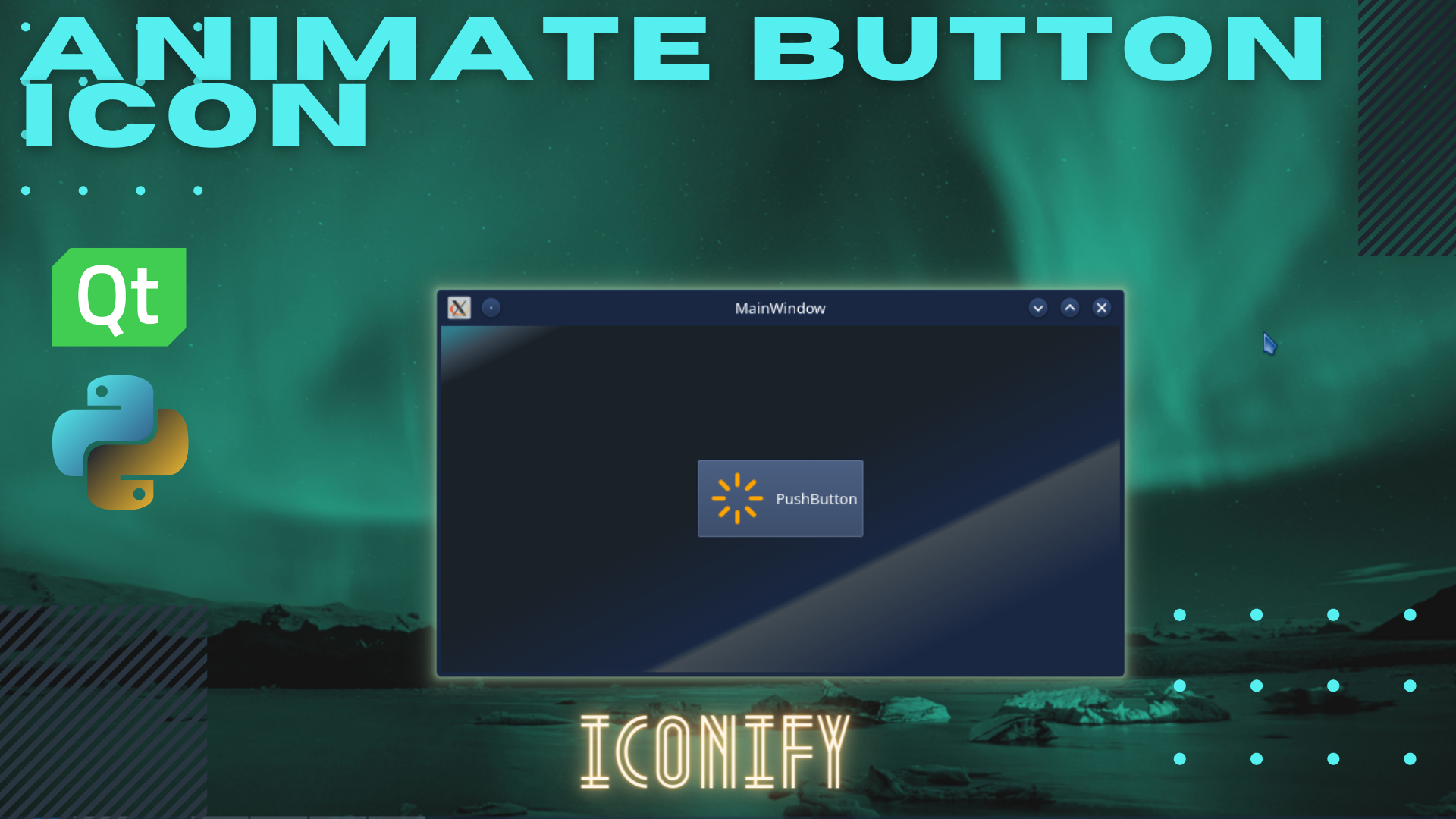
Apply button icon:
# Apply button icon
iconify(
    myButton, #button name
    icon = "font-awesome:solid:cloud-download-alt" #icon
)
Changing Icon Color:
# Apply button icon
iconify(
    myButton, #button name
    color= "#fff" #color
)
Changing Icon Size:
# Apply button icon
iconify(
    myButton, #button name
    size = 64,  #icon size
)
Animate buton icon: You can choose to animate the button icon on hover or click events. There are two types of icon animations: breathe spinn
Animate on hover:
# Apply button icon
iconify(
    myButton, #button name
    animateOn = "hover", #Animate button on click
    animation = "spin" #Spin animation
)
Animate on click:
# Apply button icon
iconify(
    myButton, #button name
    animateOn = "click", #Animate button on click
    animation = "breathe" #Breathe animation
)
The full Iconfy statement can be written as follows:
iconify(
	# Button name must be passed
    myButton,
    # Optional values
    icon = "font-awesome:solid:cloud-download-alt",
    color = "orange",
    size = 64,
    animation = "spin",
    animateOn = "click"
)
QPushButton Shadow
You can apply and animate button shadows using QT-PyQt-PySide-Custom-Widgets extension.
Apply Shadow:
applyButtonShadow(
    myButton, #button name
    color= "#fff" #shadow color
)
Shadow blur radius:
applyButtonShadow(
    myButton, #button name
    blurRadius = 100 #shadow blur radius
)
Shadow x and y offset:
applyButtonShadow(
    myButton, #button name
    # Default value is zero
    xOffset = 5, #x-offset
    yOffset = 5 #y-offset
)
Animate shadow:
applyButtonShadow(
    myButton, #button name
    # Default value is false
    animateShadow = True #Animate button shadow
)
Choose an even to animate the shadow(hover or click)
applyButtonShadow(
    myButton, #button name
    # Default value is hover
    applyShadowOn= "click"  #Animate button shadow on click
)
Change animation duration
applyButtonShadow(
    myButton, #button name
    # Default value is hover
    animateShadowDuration = 1000,  #Animate duration(1 sec)
)
The full QPushButton shadow statement can be written as follows:
applyButtonShadow(
    myButton,
    color= "#fff",
    applyShadowOn= "hover",
    animateShadow = True,
    blurRadius = 100,
    animateShadowDuration = 500,
    xOffset = 0,
    yOffset = 0
)
A. Applying QPushButton Style from a json file
The easiest way to style your QPushButtons using QT-PyQt-PySide-Custom-Widgets is to use a Json file.
Create a Json file inside your project folder, name it “style.json”. Follow the following steps to style your buttons:
Create a QPushButton object that will contain a list of all the buttons you want to style.
{
	"QPushButton": [
		{
			"name": "button1"
		},
		{
			"name": "button2"
		},
		{
			"name": "button3"
		}
	]
}
Now assuming your UI has a QPushButton named “myButton”,
Apply Theme
We are going to apply the pre-set theme number “2” to “myButton”.
{
	"QPushButton": [
		{
			"name": "myButton",
			"theme": "2"
		}
	]
}
You can also apply the custom theme of your choice by passing two colors.
{
	"QPushButton": [
		{
			"name": "myButton",
			"customTheme": [
				{
				"color1": "#000",
				"color2": "rgb(37, 150, 190)"
				}
			]
		}
	]
}
Set the default style that will be applied to the button during and after the animation process.
{
	"QPushButton": [
		{
			"name": "myButton",
			"defaultStyle": [
				"border-style: solid;",
				"border-width: 2px;",
			    "border-radius: 3px;",
				"color: #d3dae3;",
				"padding: 5px;"
			]
		}
	]
}
Set the style that will be applied the button after the animation is done playing.
{
	"QPushButton": [
		{
			"name": "myButton",
			"fallBackStyle": [
				"background-color: green"
			]
		}
	]
}
Animate button background and border
The default value is “both”, which will animate the backround color and border.
Animate border alone:
{
	"QPushButton": [
		{
			"name": "myButton",
			"animation": "border"
		}
	]
}
Animate background alone:
{
	"QPushButton": [
		{
			"name": "myButton",
			"animation": "background"
		}
	]
}
The default trigger event for animation is hover. Animate on click event:
{
	"QPushButton": [
		{
			"name": "myButton",
			"animateOn": "click"
		}
	]
}
Animate on hover event:
{
	"QPushButton": [
		{
			"name": "myButton",
			"animateOn": "hover"
		}
	]
}
Set the background and border style animation duration.
{
	"QPushButton": [
		{
			"name": "myButton",
			"animationDuration": 1000
		}
	]
}
Apply button icon and icon animation
Select icon:
{
	"QPushButton": [
		{
			"name": "myButton",
			"iconify": [
				{
					"icon": "dash:admin-generic"
				}
			]
		}
	]
}
Set icon color:
{
	"QPushButton": [
		{
			"name": "myButton",
			"iconify": [
				{
					"color": "white"
				}
			]
		}
	]
}
Set icon size:
{
	"QPushButton": [
		{
			"name": "myButton",
			"iconify": [
				{
					"size": 32
				}
			]
		}
	]
}
Set icon animation(spin or breathe):
{
	"QPushButton": [
		{
			"name": "myButton",
			"iconify": [
				{
					"animation": "breathe"
				}
			]
		}
	]
}
Set icon animation trigger event (click or hover):
{
	"QPushButton": [
		{
			"name": "myButton",
			"iconify": [
				{
					"animateOn": "hover"
				}
			]
		}
	]
}
Full Iconify Json object:
{
	"QPushButton": [
		{
			"name": "myButton",
			"iconify": [
				{
					"icon": "dash:admin-generic",
					"color": "white",
					"size": 32,
					"animation": "breathe",
					"animateOn": "hover"
				}
			]
		}
	]
}
Apply an animate button shadow
Set shadow color:
{
	"QPushButton": [
		{
			"name": "myButton",
			"shadow":[
				{
					"color": "white"
				}
			]
		}
	]
}
Set shadow blur radius:
{
	"QPushButton": [
		{
			"name": "myButton",
			"shadow":[
				{
					"blurRadius": 100
				}
			]
		}
	]
}
Set shadow x and y offset:
{
	"QPushButton": [
		{
			"name": "myButton",
			"shadow":[
				{
					"xOffset": 2,
					"yOffset": 2
				}
			]
		}
	]
}
Animate shadow: The default value is False
{
	"QPushButton": [
		{
			"name": "myButton",
			"shadow":[
				{
					"animateShadow": true
				}
			]
		}
	]
}
Set shadow animation trigger event: If left empty or not specified, the shadow will be applied on button object creation.
Apply shadow on click:
{
	"QPushButton": [
		{
			"name": "myButton",
			"shadow":[
				{
					"applyShadowOn": "click"
				}
			]
		}
	]
}
Apply shadow on hover:
{
	"QPushButton": [
		{
			"name": "myButton",
			"shadow":[
				{
					"applyShadowOn": "hover"
				}
			]
		}
	]
}
Set the shadow animation duration:
{
	"QPushButton": [
		{
			"name": "myButton",
			"shadow":[
				{
					"animateShadowDuration": 500
				}
			]
		}
	]
}
Full json shadow stylesheet:
{
	"QPushButton": [
		{
			"name": "myButton",
			"shadow":[
				{
					"color": "white",
					"animateShadow": true,
					"applyShadowOn": "hover",
					"animateShadowDuration": 500,
					"blurRadius": 100,
					"xOffset": 2,
					"yOffset": 2
				}
			]
		}
	]
}
Loading the json style from “style.json” file to the UI
Start by importing the custom widgets to your main file:
from Custom_Widgets import *
To apply the Json stylesheet to your button, use:
loadJsonStyle(MainWindow_Class, UserInterface_Class) #Apply button style from json
######################################################################
## APPLY BUTTON STYLE FROM JSON FILE
########################################################################
# Load the stylesheet for all buttons inside myFrame
# self = QMainWindow Class Object
# self.ui = Ui_MainWindow Class Object from user interface file that contains all buttons
loadJsonStyle(self, self.ui)
# Check if the button was themed/styled
if not w.wasThemed:
    # If no style was found, you can apply another style
    applyAnimationThemeStyle(w, 2) #Apply theme 2 to the button
    # OR
    # Appply your own custom theme
    applyCustomAnimationThemeStyle(w, "red", "yellow") #Apply custom theme to the button
Json Stylesheet Sample
This is a Json style example. Replace the button names with your own button names.
{
	"QPushButton": [
		{
			"name": "pushButton",
			"customTheme": [
				{
				"color1": "#2596be",
				"color2": "rgb(37, 150, 190)"
				}
			],
			"iconify": [
				{
					"icon": "dash:admin-generic",
					"color": "white",
					"size": 32,
					"animation": "breathe",
					"animateOn": "hover"
				}
			]
		},
		{
			"name": "pushButton_2",
			"theme": "2",
			"animateOn": "click",
			"shadow":[
				{
					"color": "white",
					"applyShadowOn": "click",
					"animateShadow": true,
					"animateShadowDuration": 500,
					"blurRadius": 100
				}
			],
			"iconify": [
				{
					"icon": "feather:loader",
					"color": "white",
					"size": 32,
					"animation": "spin",
					"animateOn": "hover"
				}
			]
		},
		{
			"name": "pushButton_3",
			"theme": "3",
			"animation": "border",
			"animateOn": "hover",
			"iconify": [
				{
					"icon": "font-awesome:brands:amazon",
					"color": "white",
					"size": 32,
					"animation": "spin",
					"animateOn": "click"
				}
			],
			"shadow":[
				{
					"color": "white",
					"animateShadow": true,
					"animateShadowDuration": 500,
					"blurRadius": 100,
					"xOffset": 2,
					"yOffset": 2
				}
			]
		},
		{
			"name": "pushButton_4",
			"theme": "4",
			"animation": "background",
			"iconify": [
				{
					"icon": "font-awesome:brands:google-play",
					"color": "white",
					"size": 32,
					"animation": "breathe",
					"animateOn": "click"
				}
			]
		},
		{
			"name": "pushButton_5",
			"theme": "5",
			"animationDuration": 1000,
			"iconify": [
				{
					"icon": "font-awesome:brands:bitcoin",
					"color": "white",
					"size": 32,
					"animation": "breathe",
					"animateOn": "click"
				}
			],
			"shadow":[
				{
					"color": "#2596BE",
					"applyShadowOn": "hover",
					"animateShadow": true,
					"animateShadowDuration": 500,
					"blurRadius": 100,
					"xOffset": 0,
					"yOffset": 0
				}
			]
		},
		{
			"name": "pushButton_6",
			"theme": "6",
			"animationEasingCurve": "InSine",
			"animateOn": "click",
			"iconify": [
				{
					"icon": "font-awesome:brands:grav",
					"color": "white",
					"size": 32,
					"animation": "breathe",
					"animateOn": "click"
				}
			]
		},
		{
			"name": "pushButton_7",
			"theme": "7",
			"animation": "border",
			"fallBackStyle": [
				"background-color: green"
			],
			"defaultStyle": [
				"border-style: solid;",
				"border-width: 2px;",
			    "border-radius: 3px;",
				"color: #d3dae3;",
				"padding: 5px;"
			],
			"iconify": [
				{
					"icon": "font-awesome:brands:node",
					"color": "white",
					"size": 32,
					"animation": "breathe",
					"animateOn": "hover"
				}
			]
		},
		{
			"name": "pushButton_8",
			"theme": "8",
			"animationEasingCurve": "OutInBack",
			"animationDuration": 1000,
			"iconify": [
				{
					"icon": "font-awesome:solid:heart",
					"color": "red",
					"size": 32,
					"animation": "spin",
					"animateOn": "click"
				}
			]
		},
		{
			"name": "pushButton_9",
			"theme": "9",
			"animation": "border",
			"iconify": [
				{
					"icon": "material-design:youtube",
					"color": "red",
					"size": 32,
					"animation": "spin",
					"animateOn": "hover"
				}
			]
		}

	]
}