QT-PyQt-PySide-Custom-Widgets - Custom Progress Bar / Form Progress Indicator
Install the custom widgets
pip install QT-PyQt-PySide-Custom-Widgets
Custom Progress Bar / Form Progress Indicator
Download
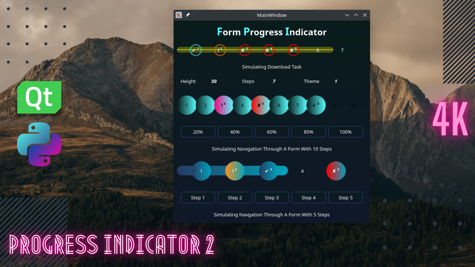
Download an example.
Adding Custom Progress Bar / Form Progress Indicator To The User Interface
Using QT Designer:
Step 1:
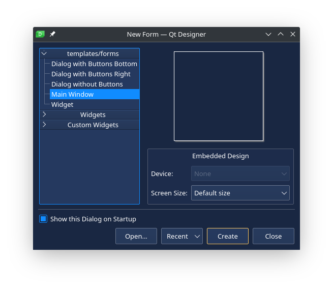
- Open QT Designer app, create the “Main Window”.
Step 2:
- Add “QWidget” container to your “centralwidget” or a container of your choice.
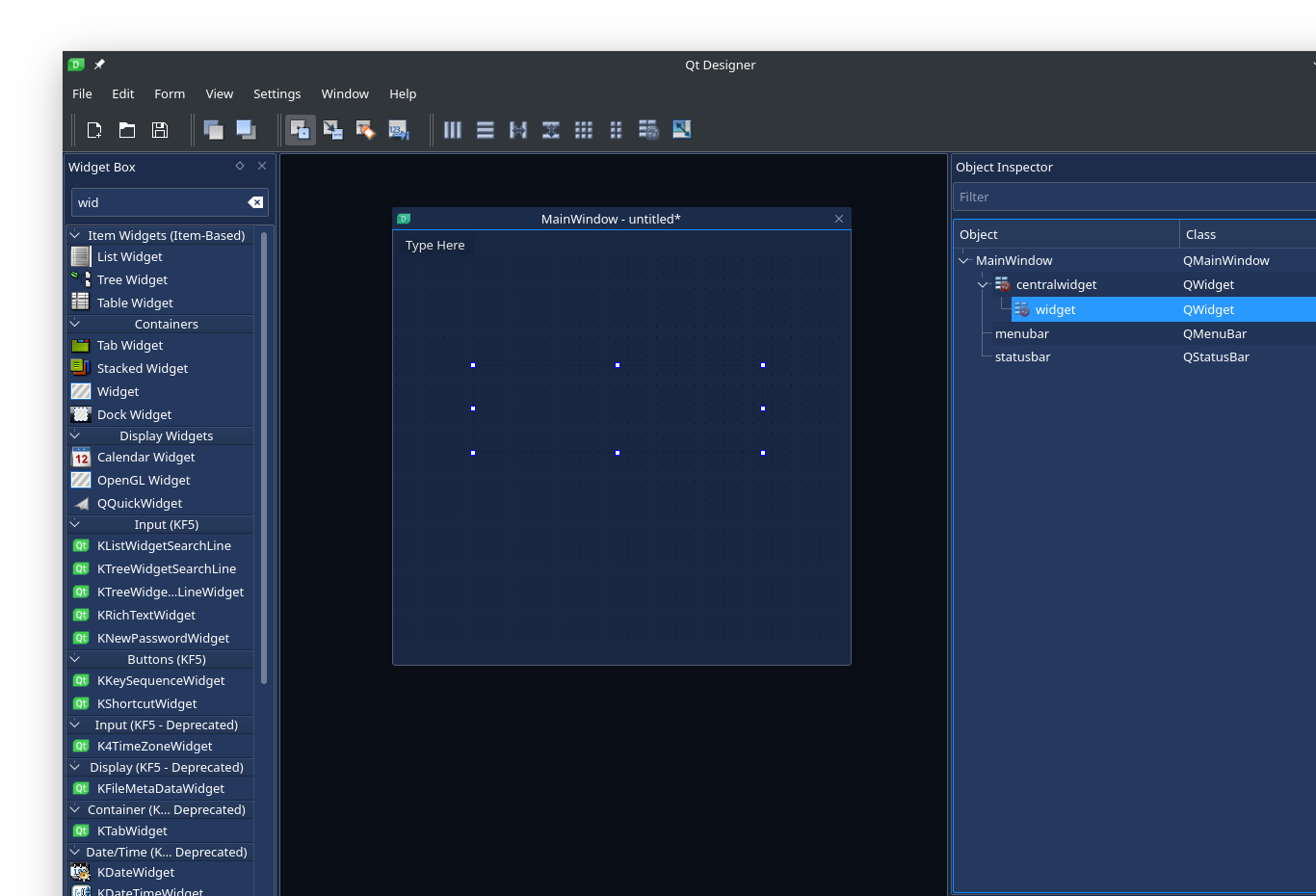
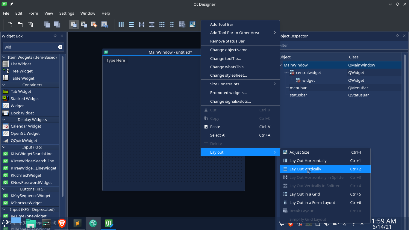
- Set the width and height of your widget, alternatively you can set the layout of the container, in this case it is the “centralwidget”
Step 3:
- Right click on the “widget” the click “promote to”. The promote window will appear.
- In “Base Class Name” select “QWidget”
- In “Promoted class name” field enter “QCustomProgressIndicator”
- In “Header file” enter “Custom_Widgets.QCustomProgressIndicator.h”
- Then Click on “Add” button
- Check the “Global Include” check mark,
- Now select the promoted class you just added then click on “Promote” button,
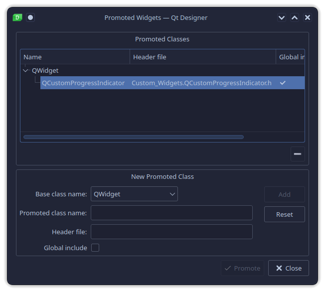
- Save the UI file then generate the interface python code.
Step 4:
- Create the “main.py” file, then import the user interace.
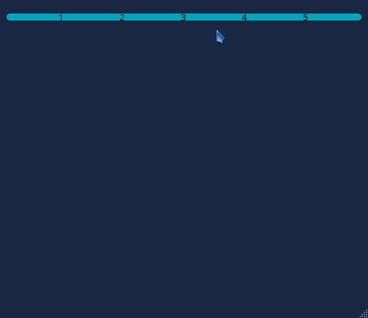
If you run “main.py”, you will get something like this:
You can also add the custom progress bar to the user interface without using QT Designer app:
Step 1:
Import the custom progress bar the file where you want to create the progress bar:
# IMPORT CUSTOM PROGRESS BAR / PROGRESS INDICATOR
from Custom_Widgets.QCustomProgressIndicator import QCustomProgressIndicator
Step 2:
Create the progress bar:
myProgressBar = FormProgressIndicator(parentContainer)
myProgressBar.setObjectName(u"widget")
# If you have a layout
myLayout.addWidget(myProgressBar)
Customizing and Animating the Custom Progress bar / Progress Indicator
Use the “updateFormProgressIndicator()” function to customize the progress bar.
Changing font color:
# CUSTOMIZE FORM PROGRESS INDICATOR
myProgressBar.updateFormProgressIndicator(
    # Set font color
    color = "#000"
)
Changing fill color:
# CUSTOMIZE FORM PROGRESS INDICATOR
myProgressBar.updateFormProgressIndicator(
    # Set fill color
    fillColor = "white"
)
Changing fill color “warning”:
The custom progress indicator has different steps, each step status can be set individually.
- For example, if you have a task that is downloading 5 files, the progress indicator will have five steps. If file one fails to download, then you can set “step 1” to show an
errororwarning. - You can also refer to YouTube video upload Form, each step where the correct video information is passed is marked with a check mark, while any step that has an error is marked with a warning sign.
# CUSTOMIZE FORM PROGRESS INDICATOR
myProgressBar.updateFormProgressIndicator(
    # Set fill color for warnings
    warningFillColor = "purple"
)
Changing fill color “errors”:
To mark steps where an error occured,
# CUSTOMIZE FORM PROGRESS INDICATOR
myProgressBar.updateFormProgressIndicator(
    # Set fill color for errors
    errorFillColor = "red"
)
Changing fill color “success”:
To mark steps that completed successfully,
# CUSTOMIZE FORM PROGRESS INDICATOR
myProgressBar.updateFormProgressIndicator(
    # Set fill color for success
    successFillColor = "pink"
)
Changing number of steps:
The default value is 5,
# CUSTOMIZE FORM PROGRESS INDICATOR
myProgressBar.updateFormProgressIndicator(
    # Set number of progress steps(default is 5)
    formProgressCount = 7
)
Changing progress animation duration:
The default value is 500,
# CUSTOMIZE FORM PROGRESS INDICATOR
myProgressBar.updateFormProgressIndicator(
    # Set progress animation duration
    formProgressAnimationDuration = 200
)
Changing progress animation easing curve:
The default value is Linear,
# CUSTOMIZE FORM PROGRESS INDICATOR
myProgressBar.updateFormProgressIndicator(
    # Set progress animation easing curve
    formProgressAnimationEasingCurve = "InOutQuint"
)
Changing progress bar height:
The default value is 60,
# CUSTOMIZE FORM PROGRESS INDICATOR
myProgressBar.updateFormProgressIndicator(
    # Set progress container height
    height = 80
)
Changing progress bar width:
The default value is 500,
# CUSTOMIZE FORM PROGRESS INDICATOR
myProgressBar.updateFormProgressIndicator(
    # Set progress container width
    width = 550
)
Changing progress starting percentage:
The default value is 0,
# CUSTOMIZE FORM PROGRESS INDICATOR
myProgressBar.updateFormProgressIndicator(
    # Set default progress percentage
    startPercentage = 50 #half
)
The full progress bar customization code will look like this:
myProgressBar.updateFormProgressIndicator(
    # Set font color
    color = "#000",
    # Set fill color
    fillColor = "white",
    # Set fill color for warnings
    warningFillColor = "purple",
    # Set fill color for errors
    errorFillColor = "red",
    # Set fill color for success
    successFillColor = "pink",
    # Set number of progress steps(default is 5)
    formProgressCount = 10,
    # Set progress animation duration
    formProgressAnimationDuration = 2000, #2seconds
    # Set progress animation easing curve
    formProgressAnimationEasingCurve = "InOutQuint",
    # Set progress container height
    height = 80,
    # Set progress container width
    width = 1000,
    # Set default progress percentage
    startPercentage = 50 #half
)
Applying pre-set progress bar themes:
QT-PyQt-PySide-Custom-Widgets has five progress bar themes wich you can apply to your progress bar instead of passing your own colors. To apply the progress bar theme:
# Slect progress bar theme (range 1-5)
myProgressBar.selectFormProgressIndicatorTheme(4)

## OR
myProgressBar.updateFormProgressIndicator(
    theme = 4
)
Using custom widget’s theme engine:
You can also use the custom widget’s theme engine to apply the progressbar theme style. The progressbar will inherit the app theme style:
#Inherit app theme style
myProgressBar.updateFormProgressIndicator(
    inheritTheme = True
)
You can also specify the colors you want to apply from your theme
#Inherit app theme colors
myProgressBar.updateFormProgressIndicator(
    # NOTE: only choose one color i.e self.theme.COLOR_TEXT_1, self.theme.COLOR_ACCENT_3, self.theme.COLOR_BACKGROUND_5

    # Set font color
    color = self.theme.COLOR_TEXT_1 ... self.theme.COLOR_TEXT_4,
    # Set fill color
    fillColor = self.theme.COLOR_BACKGROUND_1 ..... self.theme.COLOR_BACKGROUND_6,
    # Set fill color for warnings
    warningFillColor = self.theme.COLOR_ACCENT_1 ... self.theme.COLOR_ACCENT_4,
    # Set fill color for errors
    errorFillColor = self.theme.COLOR_ACCENT_1 ... self.theme.COLOR_ACCENT_4,
    # Set fill color for success
    successFillColor = self.theme.COLOR_ACCENT_1 ... self.theme.COLOR_ACCENT_4

)
Read more about the theme engine here
Animating progress bar:
In order to animate the progress bar, you have to change the progress value in terms of percentage.
# Animate progress to 60 percent
myProgressBar.animateFormProgress(60) #60 percent
Updating Progress Step Status
The progress indicator has four status. The default status in “None”. You can update each progress step indidually to indicate the status of that step.
Setting progress step status to “warning”:
# UPDATE THE PROGRESS STEP STATUS
myProgressBar.setStepStatus(
	# Step 2
    step_2_warning = True
)
Setting progress step status to “error”:
# UPDATE THE PROGRESS STEP STATUS
myProgressBar.setStepStatus(
	# Step 5
    step_5_error = True
)
Setting progress step status to “success”:
# UPDATE THE PROGRESS STEP STATUS
myProgressBar.setStepStatus(
	# Step 3
    step_3_success = True
)
Now to upadate multiple step status, you can write something like this:
# UPDATE THE PROGRESS STEP STATUS
self.ui.widget.setStepStatus(
    # Step 5
    step_5_error = True,
    # Step 2
    step_2_warning = True,
    # Step 3
    step_3_success = True
)
Another alternative way to update the progress step stays is to use “setStepStatus()” function.
# UPDATE THE PROGRESS STEP STATUS USING setStepStatus()
myProgressBar.setStepStatus(
	# progress step number
	step = 3,
	# Status ["warning", "error", "success"]
	status = "error",
	# Satus value [True, False]
	value = True
)
To reset the progress status, use “setStepStatus()” and set the value to “False”.
Reset progress step status:
Reset progress status for step 3:
Warning:
# UPDATE THE PROGRESS STEP STATUS USING setStepStatus()
myProgressBar.setStepStatus(
	# progress step number
	step = 3,
	# Status ["warning", "error", "success"]
	status = "warning",
	# Satus value [True, False]
	value = False
)
Error:
# UPDATE THE PROGRESS STEP STATUS USING setStepStatus()
myProgressBar.setStepStatus(
	# progress step number
	step = 3,
	# Status ["warning", "error", "success"]
	status = "error",
	# Satus value [True, False]
	value = False
)
Success:
# UPDATE THE PROGRESS STEP STATUS USING setStepStatus()
myProgressBar.setStepStatus(
	# progress step number
	step = 3,
	# Status ["warning", "error", "success"]
	status = "success",
	# Satus value [True, False]
	value = False
)
Add and customize your progress bar using a JSon File.
Read here on how to generate a project using the project creator. Skip this part if your app already has a “json stylesheet” for the custom widgets.
Once you have created your project, you can customize your progressbar from a json file as shown:
{
   "QCustomProgressIndicator": [
        {
            "name": "myProgressBar",
            "color": "THEME.COLOR_TEXT_1",
            "fillColor": "THEME.COLOR_BACKGROUND_2",
            "warningFillColor": "THEME.COLOR_ACCENT_3",
            "errorFillColor": "THEME.COLOR_ACCENT_2",
            "successFillColor": "THEME.COLOR_ACCENT_1",
            "formProgressCount": 5,
            "formProgressAnimationDuration": 2000,
            "formProgressAnimationEasingCurve": "OutBack",
            "height": 5,
            "width": 500,
            "startPercentage": 0,
            "theme": 3,
            "inheritTheme": true
        }
    ]
}
- “name” : your widget name
- “color”: the text color, in this case “THEME.COLOR_TEXT_1” is the theme text color. You can also pass a hex value ie “#fff”. This also applies to “fillColor”, “warningFillColor”, “errorFillColor” and “successFillColor”.
- You can also ignore the above colors and apply one of the preset themes(We applied theme 3)
- You can make your progressbar inherit the theme style without specifying a preset theme or theme colors by using “inheritTheme” bool, set it to true.
Json style for multiple progressbar might look like this:
{
   "QCustomProgressIndicator": [
        {
            "name": "myProgressBar",
            "color": "THEME.COLOR_TEXT_1",
            "fillColor": "THEME.COLOR_BACKGROUND_2",
            "warningFillColor": "THEME.COLOR_ACCENT_3",
            "errorFillColor": "THEME.COLOR_ACCENT_2",
            "successFillColor": "THEME.COLOR_ACCENT_1",
            "formProgressCount": 5,
            "formProgressAnimationDuration": 2000,
            "formProgressAnimationEasingCurve": "OutBack",
            "height": 5,
            "width": 500,
            "startPercentage": 0
        },
        {
            "name": "myProgressBar2",
            "formProgressCount": 10,
            "formProgressAnimationDuration": 1000,
            "formProgressAnimationEasingCurve": "OutBack",
            "height": 5,
            "width": 600,
            "startPercentage": 10,
            "theme": 3,
        },
        {
            "name": "myProgressBar3",
            "formProgressCount": 5,
            "formProgressAnimationDuration": 2000,
            "formProgressAnimationEasingCurve": "OutBack",
            "height": 5,
            "width": 500,
            "startPercentage": 0,
            "inheritTheme": true
        },
        {
            "name": "myProgressBar4",
            "color": "#fff",
            "fillColor": "#000",
            "warningFillColor": "#E41F1F",
            "errorFillColor": "#E4E41F",
            "successFillColor": "#1FE430",
            "formProgressCount": 5,
            "formProgressAnimationDuration": 2000,
            "formProgressAnimationEasingCurve": "Linear",
            "height": 5,
            "width": 500,
            "startPercentage": 0
        },
    ]
}